Yangchon Brewery
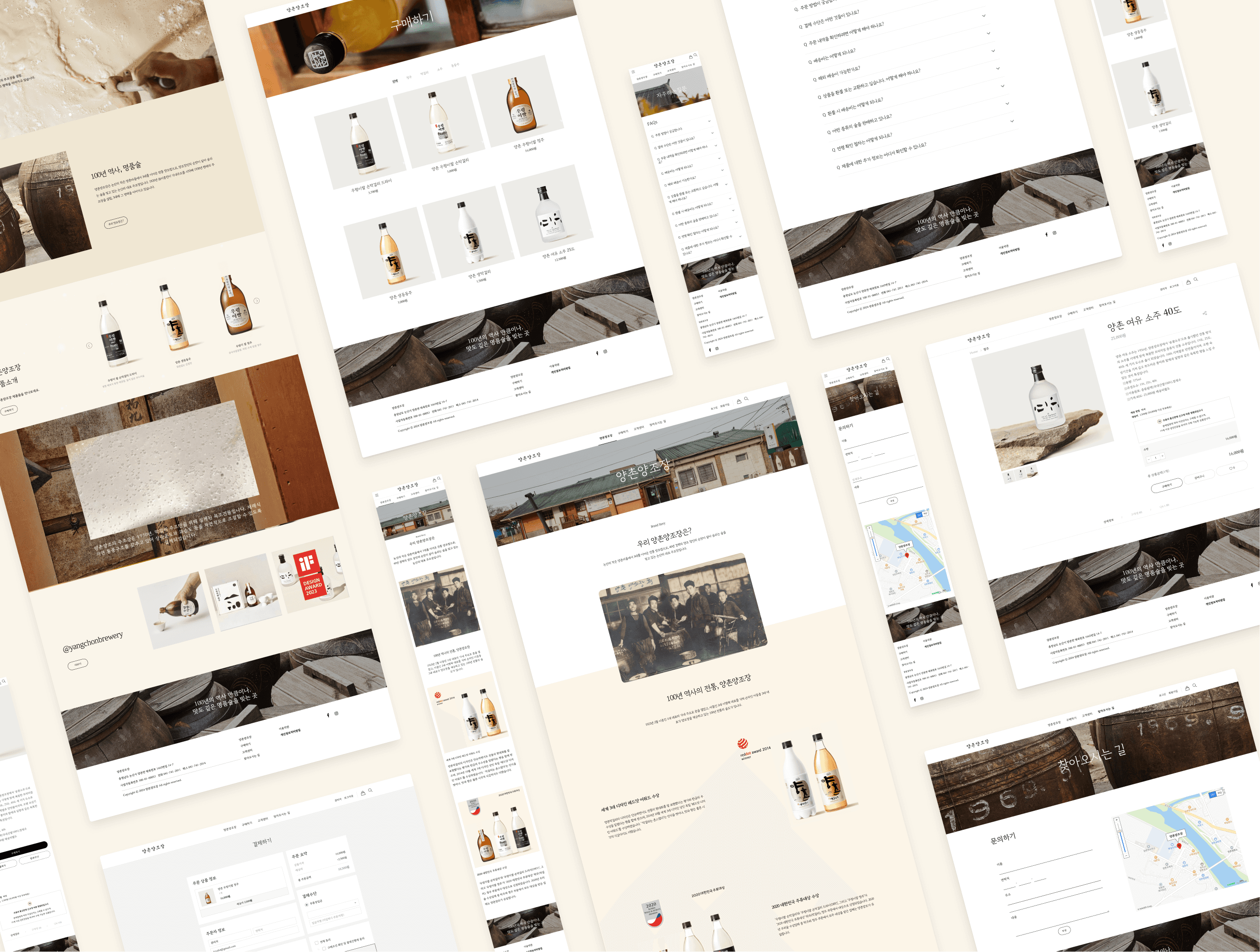
I redesigned Yangchon Brewery's website, blending its rich heritage with modern design to enhance its digital presence.
Role
UI/UX Designer - UX Design, Web Design, Visual Design, Prototyping, Usability Testing, Art Direction
Duration
12 weeks
Tools
Figma, Illustrator, Photoshop, Google forms, ImWeb
Outcomes
Positive feedback from users on the new visual appeal.
24%
Increase in Page Views Per Session.
62%
Increase in Mobile Traffic.
52%
Increase in Online Sales.
Preview
Overview
Yangchon Brewery, with over 100 years of history, is a renowned Korean brewery celebrated for its high-quality traditional beverages like makgeolli, blending ancient brewing methods with modern design, earning accolades such as the iF Design and Red Dot Design Awards.
User Research
14 Participants
· User survey : 14
· Interview : 6
· Usability Testing
Requirement
Yangchon brewery Customers
Demography
· 20s~50s
· 50% Male and 50% Female
Key Finiding
of participants find the design outdated.
72%
of participants find the navigation confusing.
90%
of participants are frustrated with mobile usability.
80%
of participants want to shop online.
Solution
Update visuals to reflect contemporary trends while honoring the brewery’s history.
Improve Usability
Simplify navigation and enhance search functionality for easier information access.
Support Mobile
Create a responsive design for seamless use on smartphones and tablets.
Add E-commerce
Enable online shopping with a secure, user-friendly checkout process.
Problem Statement
How might we modernize Yangchon Brewery’s digital presence to enhance user engagement, support mobile users, and boost online sales while preserving the brewery’s rich heritage?
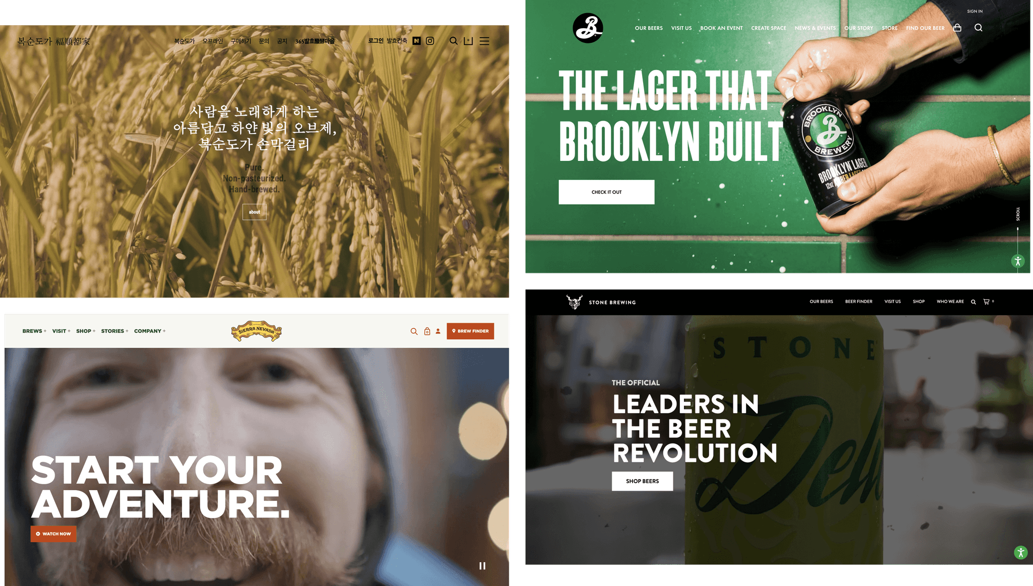
Competitive Analysis
Boksoon Brewery (Website: boksoon.com)
Integrate elements of Korean culture.
Use a modern design approach.
Brooklyn Brewery (Website: brooklynbrewery.com)
Clearly communicate the brand’s history and values.
Keep the website easy to navigate.
Sierra Nevada Brewing Co. (Website: sierranevada.com)
Use high-quality images and videos to enhance product pages.
Ensure the site is fully responsive for mobile devices.
Stone Brewery (Website: stonebrewing.com)
Use high-quality images and visually appealing layouts.
Provide extensive details on products and processes.
Information Architecture
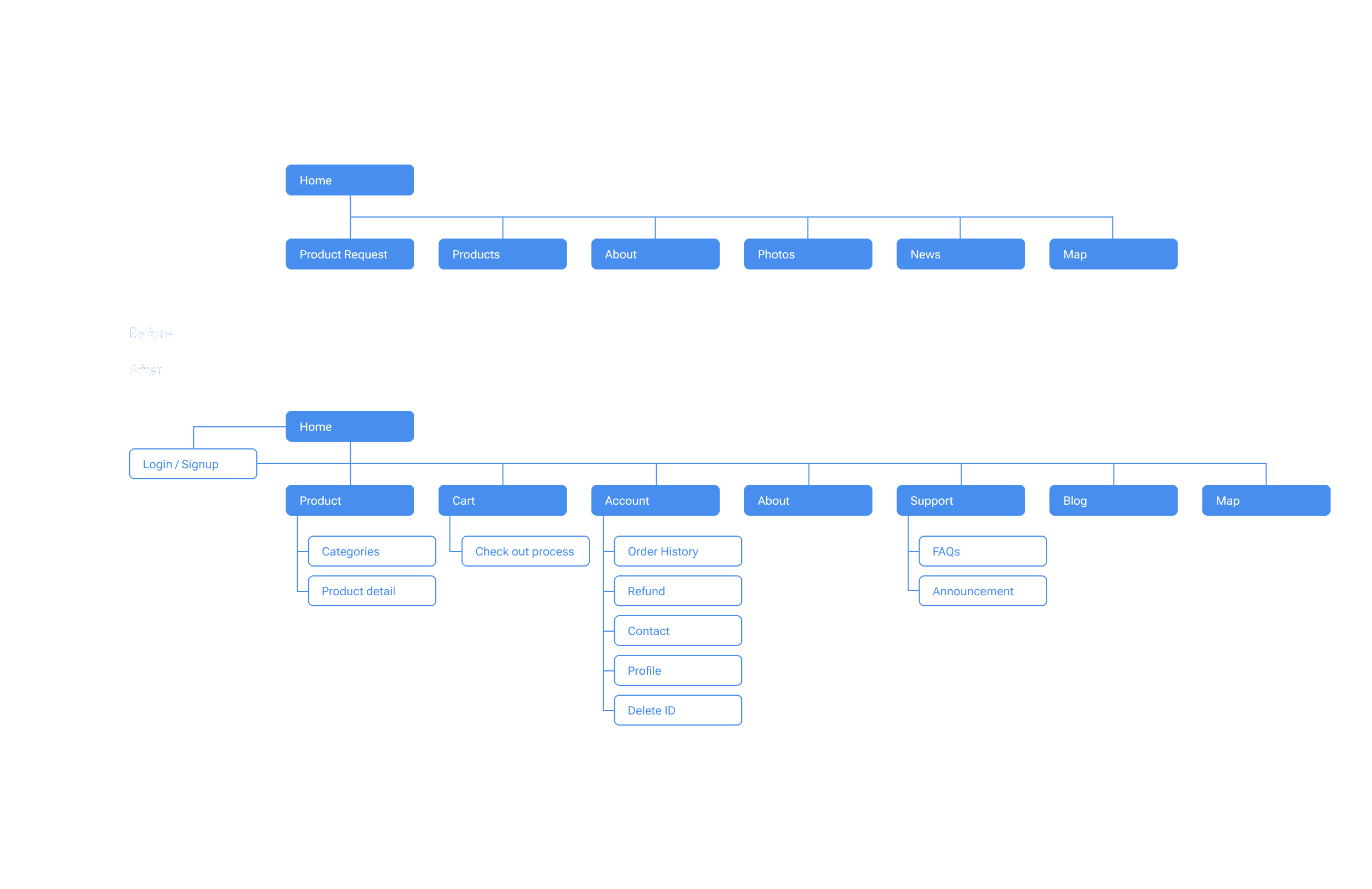
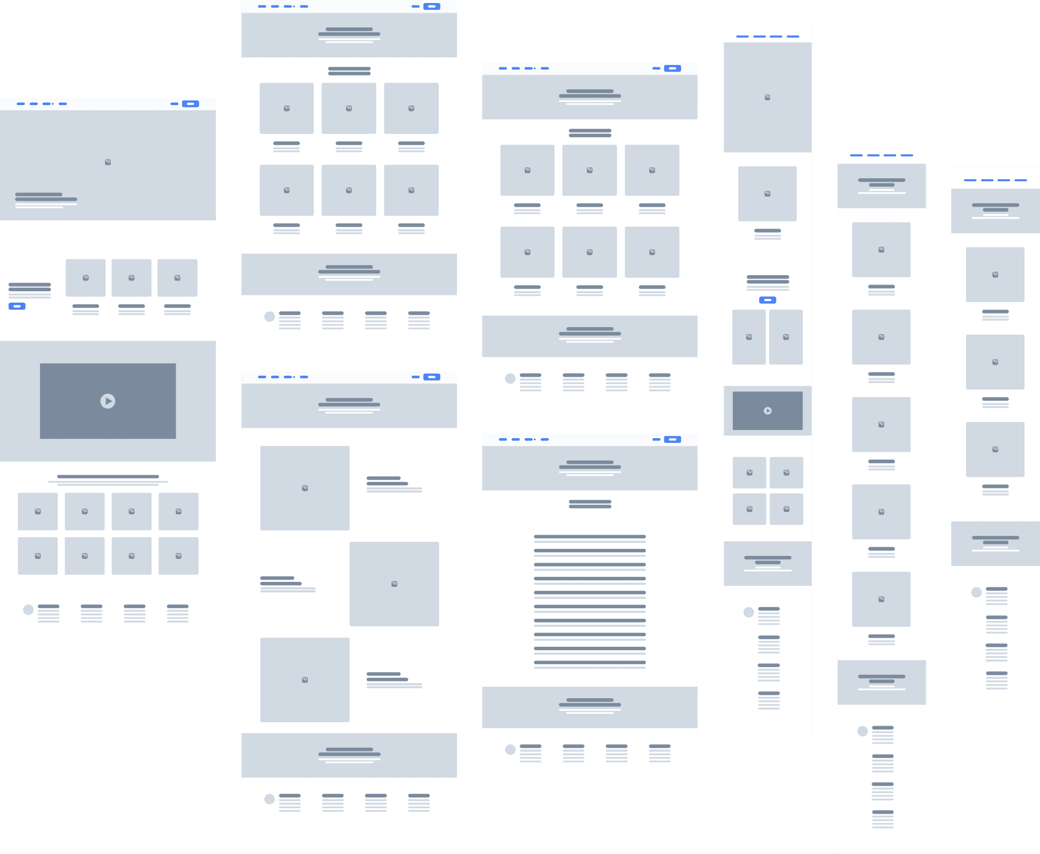
Low Fidelity
Design Exploration
Home page
Feedback from Client
Integrate design elements that reflect the rich cultural heritage of Korea.
Use High-Quality Pictures
and Videos for Engagement
Utilize high-quality visuals to capture user attention and highlight products.
Highlight Awards and
Achievements
Prominently showcase the brewery’s awards and achievements.
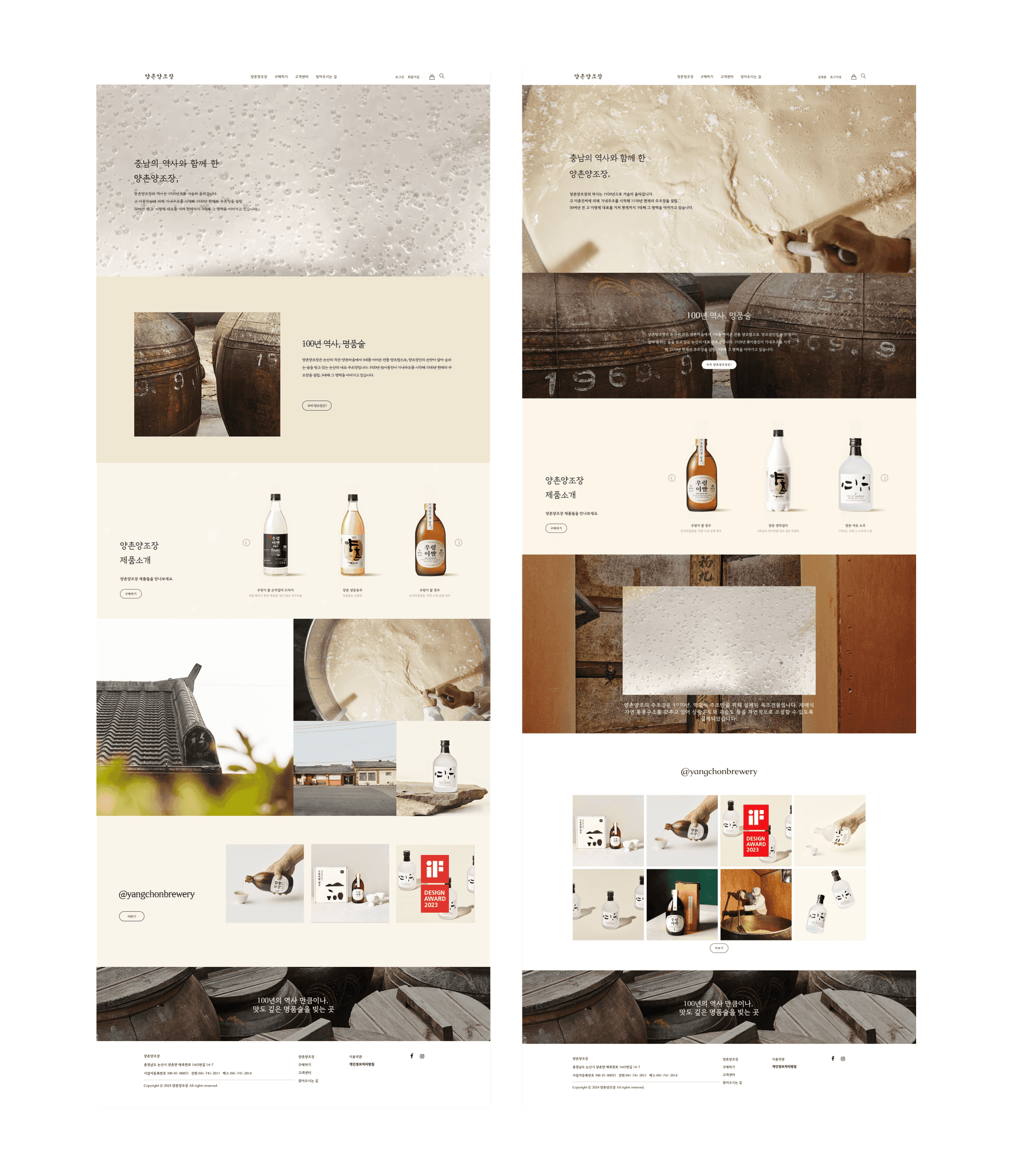
Final Design
Main page
Trendy and Dynamic Hero Image
Replaced the outdated hero image with trendy videos and new images that convey a modern and Korean aesthetic. Integrated Instagram to ensure images are automatically updated, keeping the content fresh. Added product introductions and storytelling elements to engage users more effectively.Simplified Navigation
Streamlined the website's navigation, organizing it in a more intuitive and user-friendly manner. This change makes it easier for users to find the information they need quickly and efficiently.Visible Footer
Redesigned the footer to ensure it is clearly visible and accessible. The new footer provides quick access to essential links and additional information, improving the overall user experience.
Product
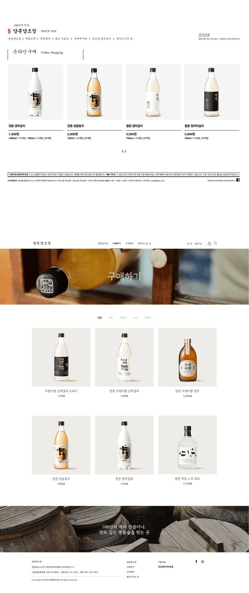
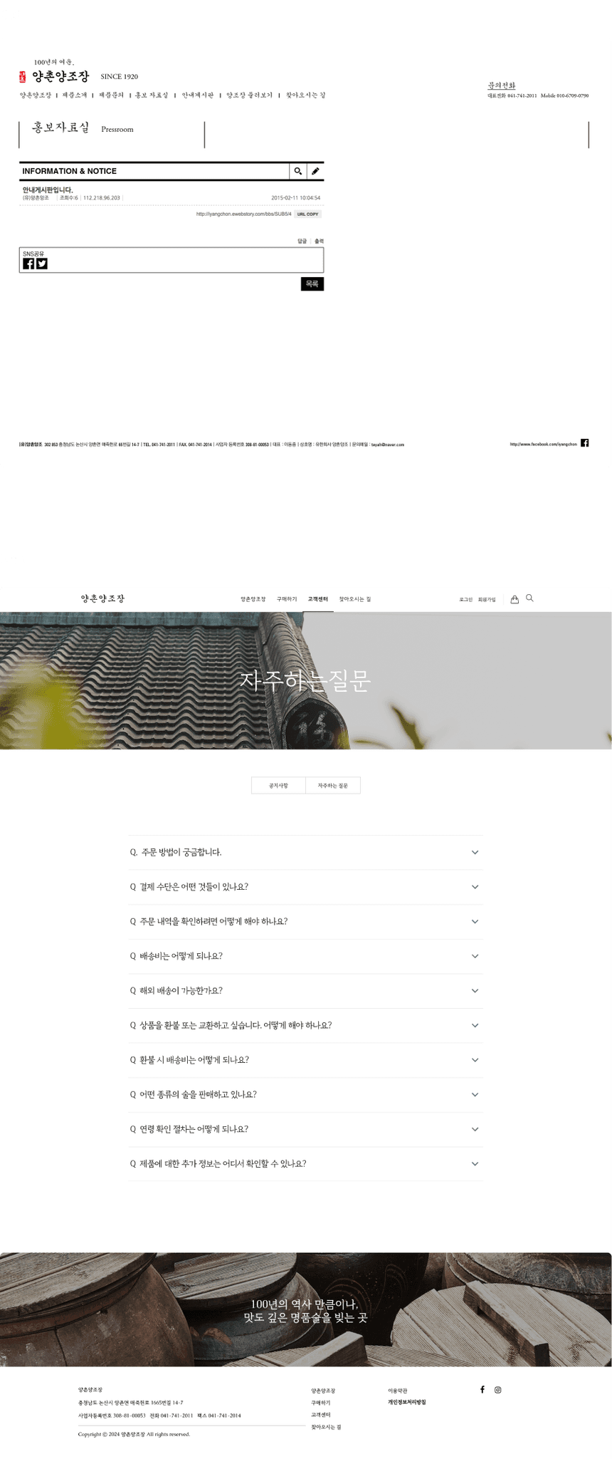
Enhanced Product Page
The product page was divided into two separate pages, making it inconvenient for users to browse all products. It did not cater to the variety of products effectively.
Consolidated the product page into a single, comprehensive page that features all six products. Introduced a filter system to help users easily find different types of beverages, making the browsing experience more convenient and user-friendly.
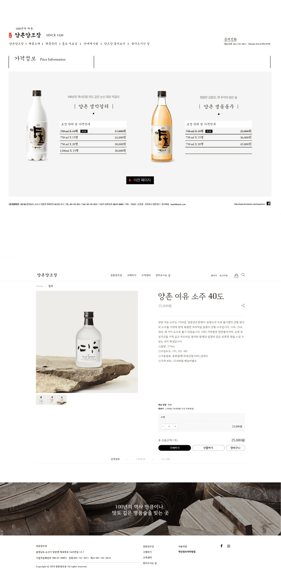
Product Detail
Reviews and Cart
Enhanced the product detail pages to include customer reviews and a shopping cart function. This addition improves the e-commerce functionality, allowing users to read reviews, add items to their cart, and make purchases directly from the website.
FAQs
Added a comprehensive FAQ section with anticipated questions and answers. This helps customers find information quickly and reduces the need for direct inquiries.
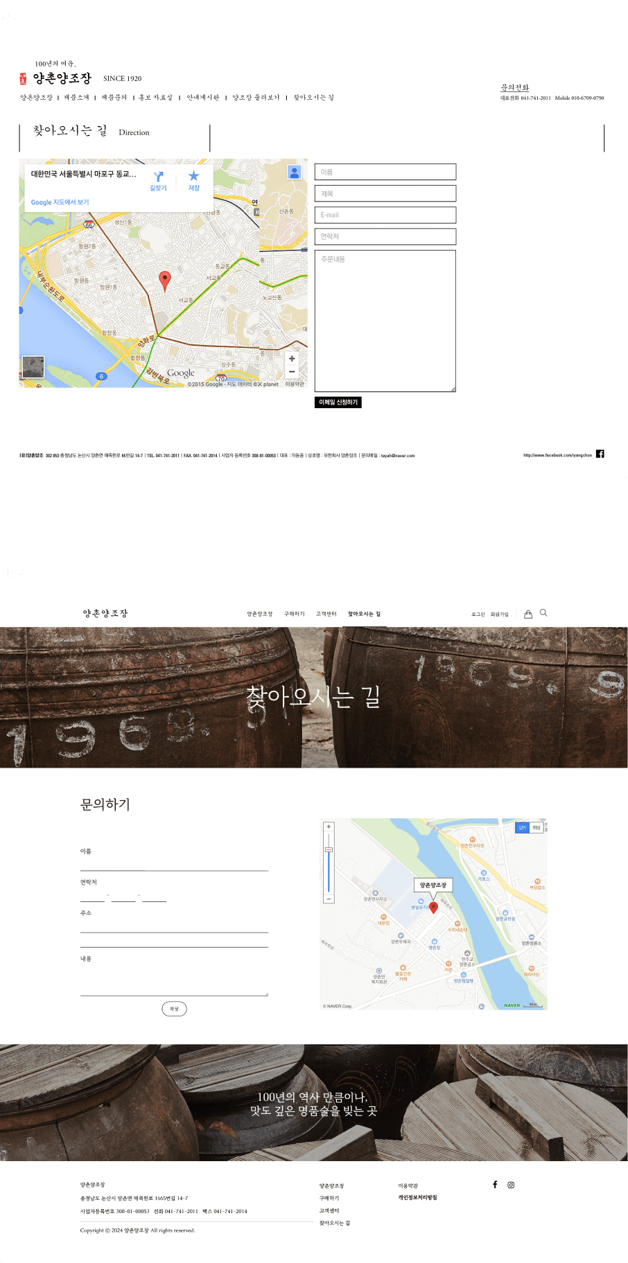
Map
Switched from Google Maps to KakaoMap and Naver Map, which are more widely used in Korea. This makes it easier for local users to find directions to the brewery.
About Us
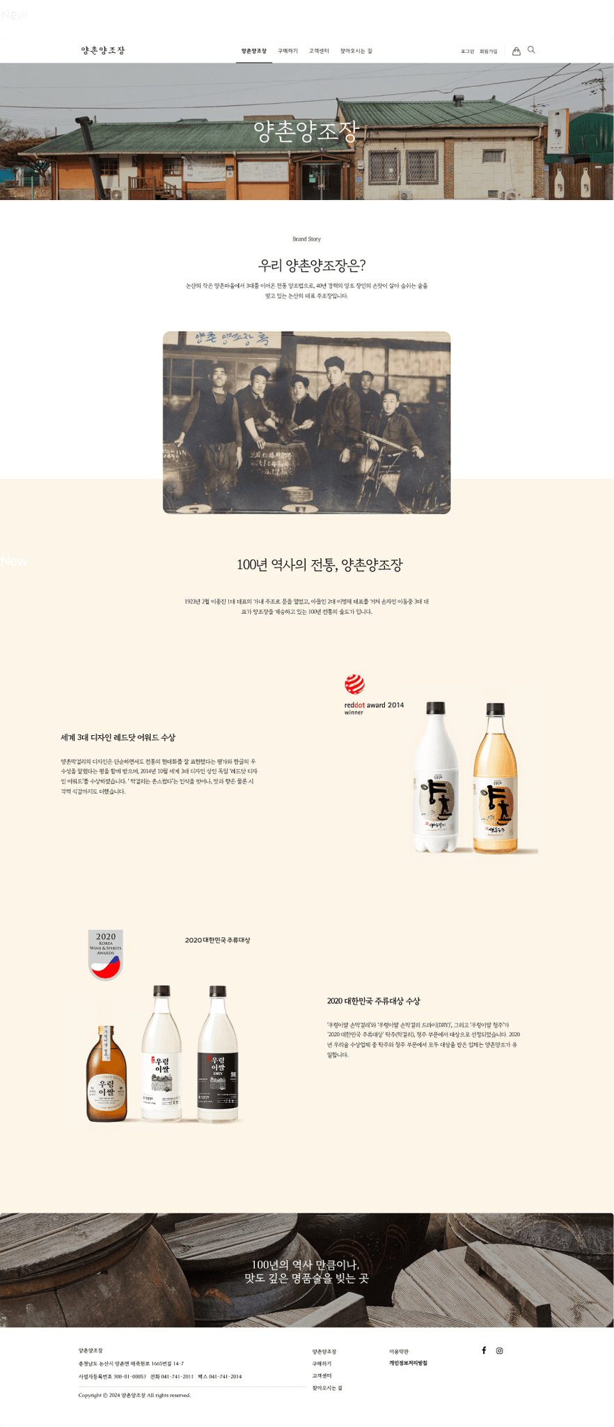
About Us Page
Introduced a new "About Us" page that shares the story of Yangchon Brewery and highlights its achievements. This page includes information about the brewery’s history, its brewing process, and its awards, providing visitors with a deeper understanding of the brand.
Mobile Experience
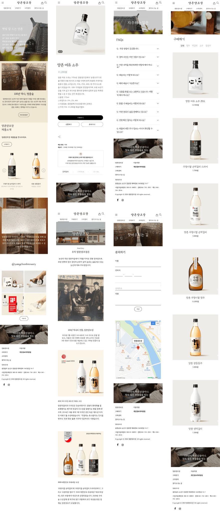
Optimized Mobile Experience
Introduced a new "About Us" page that shares the story of Yangchon Brewery and highlights its achievements. This page includes information about the brewery’s history, its brewing process, and its awards, providing visitors with a deeper understanding of the brand.
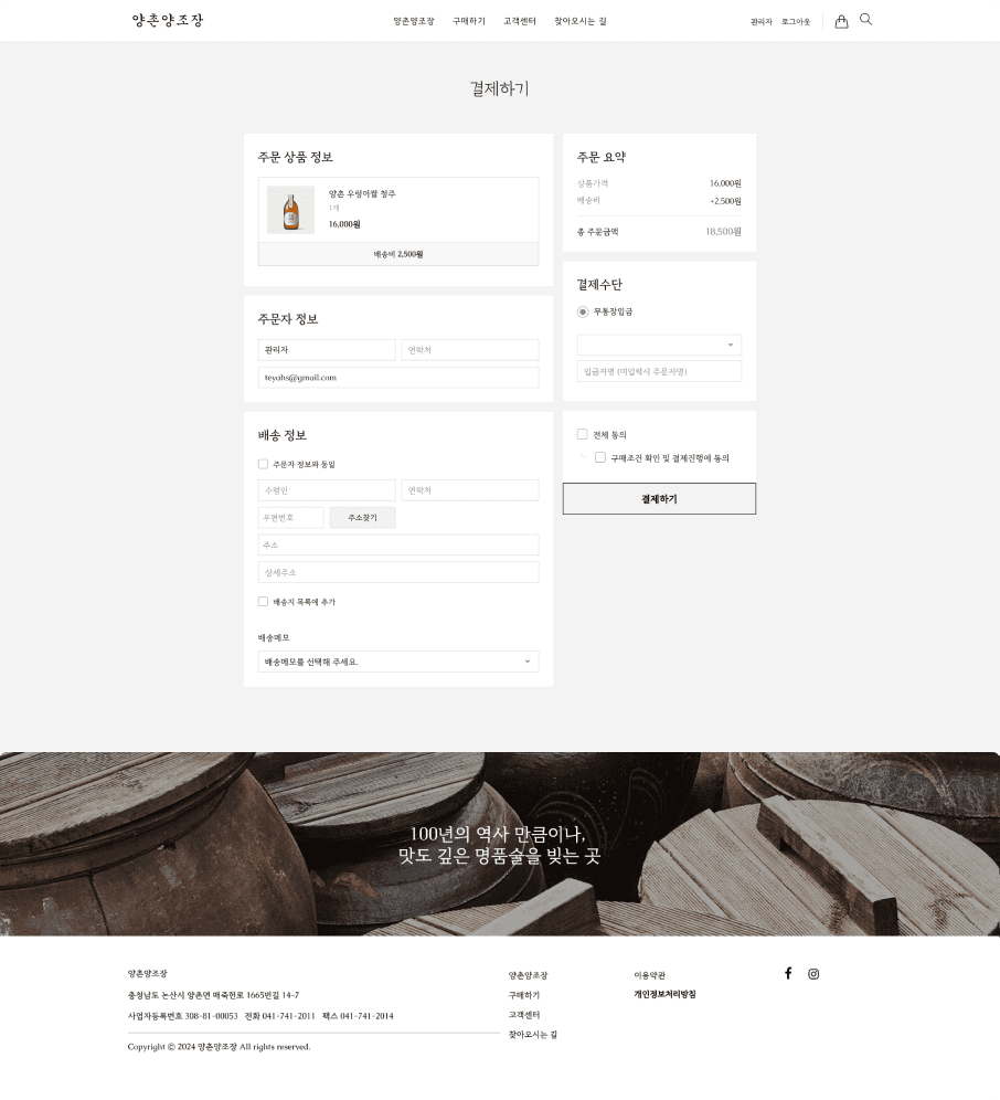
Payment
Optimized Mobile Experience
Introduced a new "About Us" page that shares the story of Yangchon Brewery and highlights its achievements. This page includes information about the brewery’s history, its brewing process, and its awards, providing visitors with a deeper understanding of the brand.
Reflection
What’s Next?
· Develop a reservation page for brewery experiences.
· Install a chatbot and update the FAQ section.
· Build a blog.
Lessons Learned
The website had a rich history and tradition, but it also had many areas that needed improvement. My goal was to modernize it and create an experience where users could virtually explore the brewery, both directly and indirectly. I enjoyed the process of enhancing the photos, art direction, and maintaining communication with the client. Starting from the website architecture and creating the sitemap, I focused on making the site user-friendly while aligning with business goals, ultimately building an e-commerce platform that users could easily navigate.

