Soroci
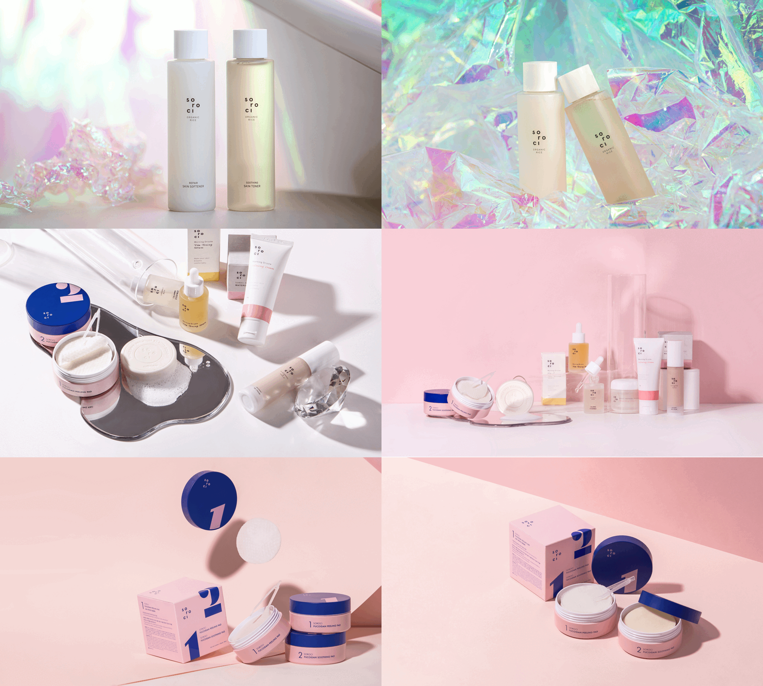
I designed the US website for Soroci, a Korean cosmetic brand, as part of their expansion into the US market. The site was tailored to appeal to a new audience while maintaining the brand’s identity and ensuring a seamless user experience.
Role
UI/UX Designer - UX Design, Web Design, Visual Design, Prototyping, Illustration, Art Direction
Duration
12 weeks
Tools
Sketch, Illustrator, Photoshop, Shopify
Home
A natural beauty brand for a new market
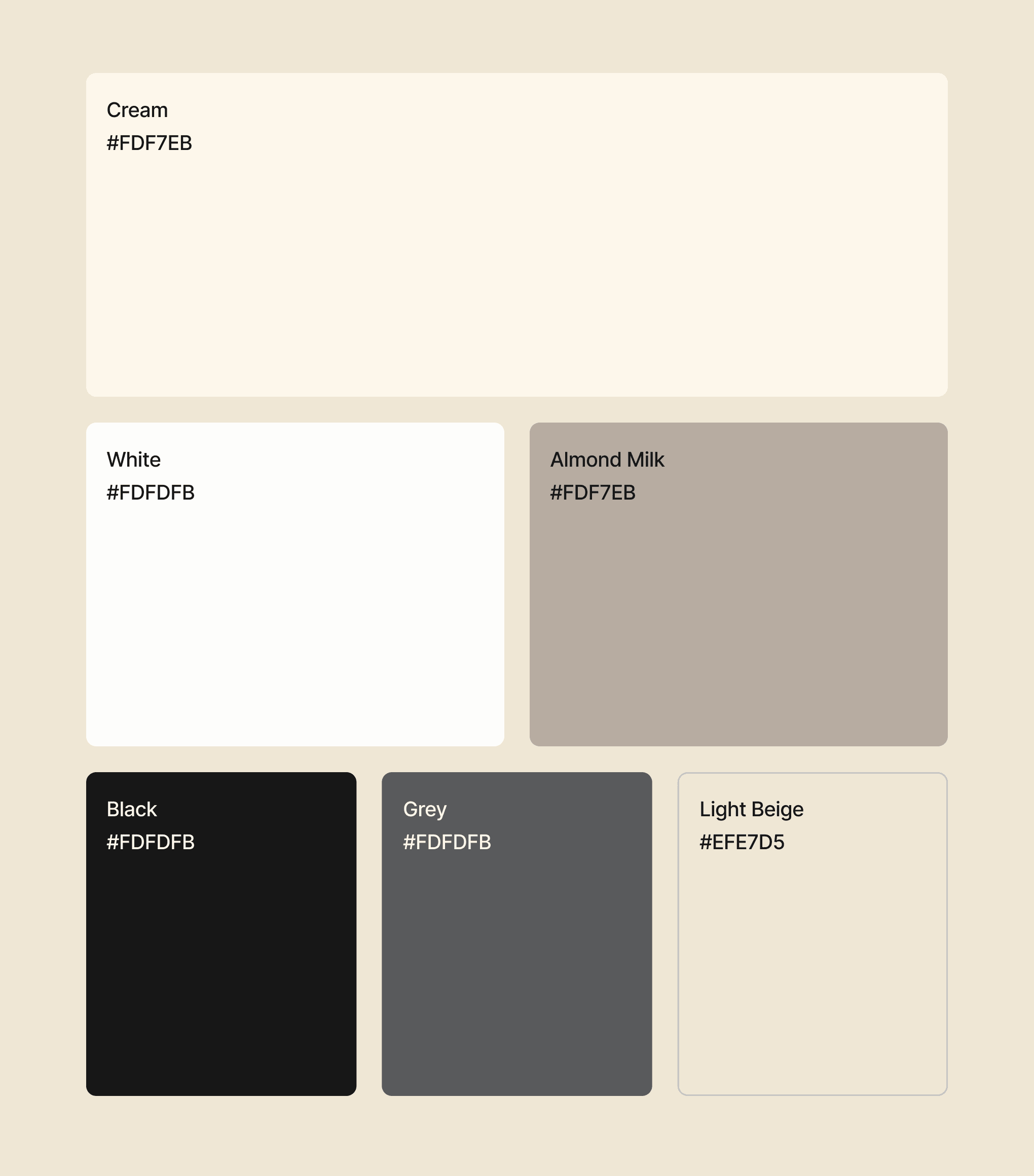
Soroci, a Korean cosmetic brand, launched its US website to expand its reach. I designed the site to reflect the brand’s focus on natural beauty, using a neutral color palette and lightly retouched, authentic photography. The minimal design creates a calm, inviting experience that aligns with Soroci’s ethos of understated beauty.
Shop
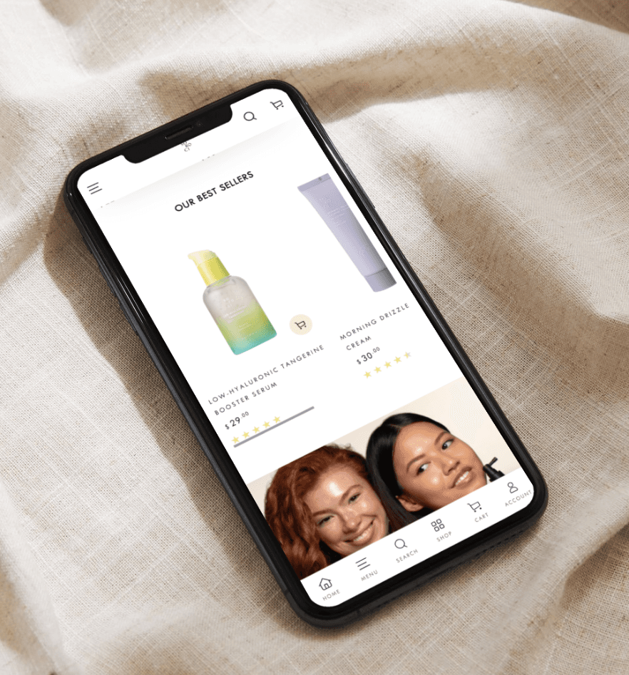
I designed the Shop page for Soroci with simplicity in mind. The clean layout highlights products like skincare bundles, making it easy to browse and shop. The minimalist design, with neutral tones and natural imagery, reflects Soroci’s focus on authentic beauty.
Art Direction
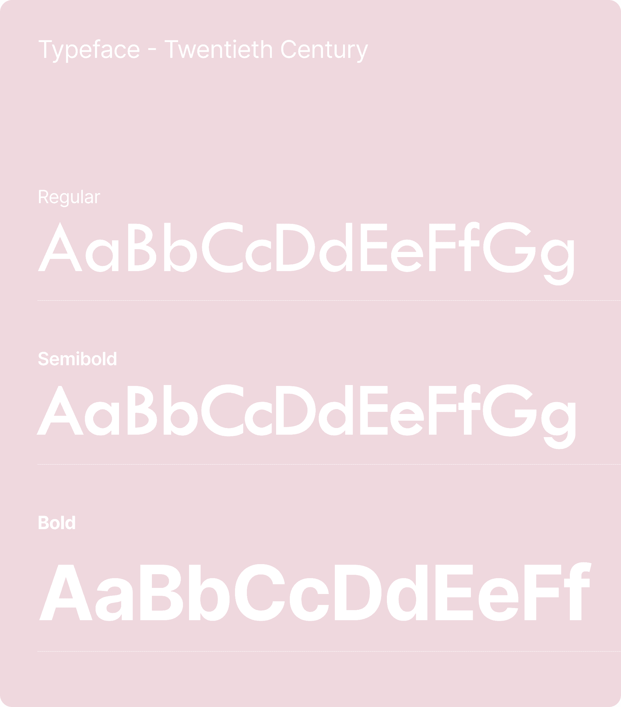
I retouched photos for Soroci’s US website while maintaining a natural, realistic look to promote authentic beauty standards. A neutral color palette was used to evoke a sense of calm, aligning with the brand’s aesthetic.


