Hyassistant
Role
Solo project
Duration
12 weeks
The Problem
FEATURE 01
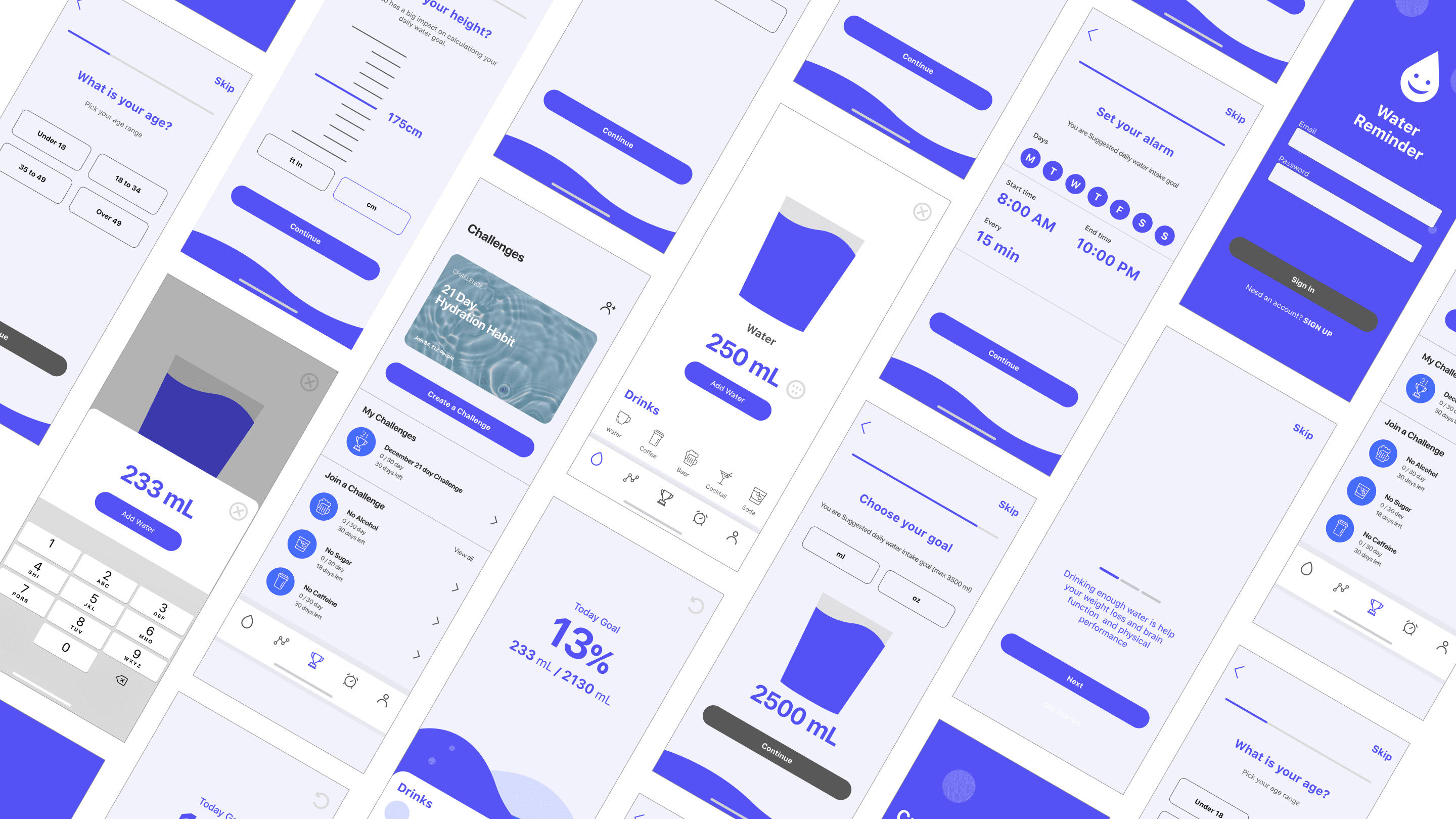
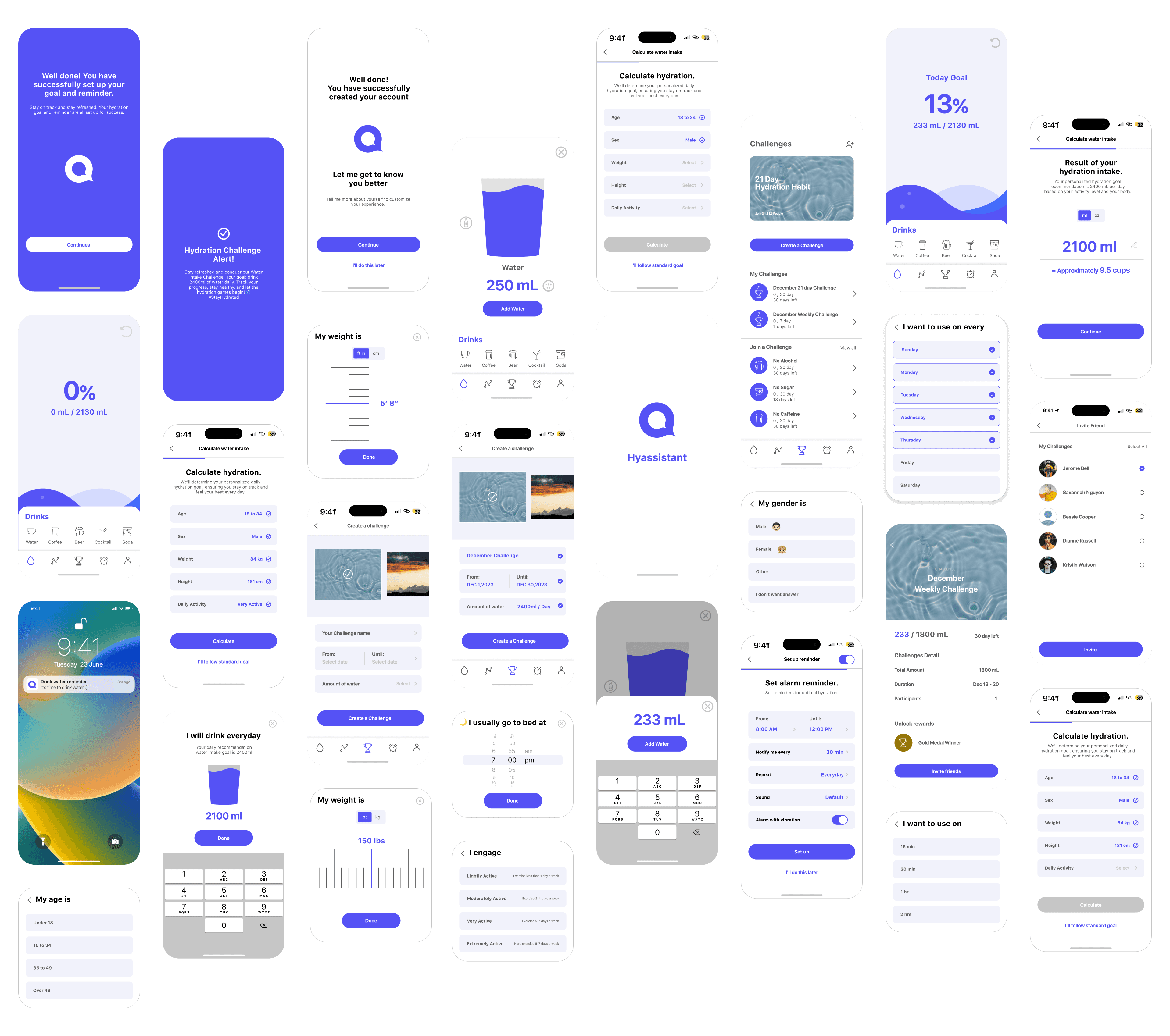
During the initial onboarding settings, users can determine their personalized daily water intake based on their body specifications and set up reminders with alarms.
FEATURE 02
Drink Tracker
Allows users to easily log their daily water intake, helping them keep track and improve their hydration habits.

FEATURE 03
Challenge
Users can join or create fun hydration challenges with friends. Users can track their daily water intake, earn badges, and encourage each other, making staying hydrated a shared and motivating experience.

Design Process
01/
Empathize
02/
Define
· User Quotes
· Persona
· User Journey Map
03/
Ideate
· Idea Brainstorming
· Sketch
· Information
Architecture
· User Task Flow
Background Resarch
of adults in the US drink enough water every day
NYpost
47%
of Americans Don't Drink Enough Water
Civicscience
75%
drink at most 2.5 cups of water, the equivalent of one bottled water, a day. The truth is most Americans are dehydrated.
Strive
User Research
24 Participants
· User survey : 24
· Interview : 6
Requirement
A person without any illness or disease
Demography
· 10s~50s
· 50% Male and 50% Female
User Quotes from User Interview

"I'm not sure about my daily water intake, and I don't usually drink enough water."
Anatoli / Designer

"I understand the importance of staying hydrated for my health,
but I find it challenging."
Jose / Marketing Manager

"I usually prefer coffee, sparkling water, and soup over plain water because it has no taste."
Jay / Data Analyst

“Creating a habit of drinking water is not easy, even if one tries."
Sally / Art director
Key Finding
of participants take less than 5 cups of water daily and reported no issues.
66%
of participants mentioned they drink less water when they are busy.
83%
of participants expressed difficulty in remembering how much water they had drunk.
62%
of participants mentioned a lack of motivation to drink enough water.
79%
Most participants mentioned preferring coffee, tea, sparkling water, and soup over plain water.
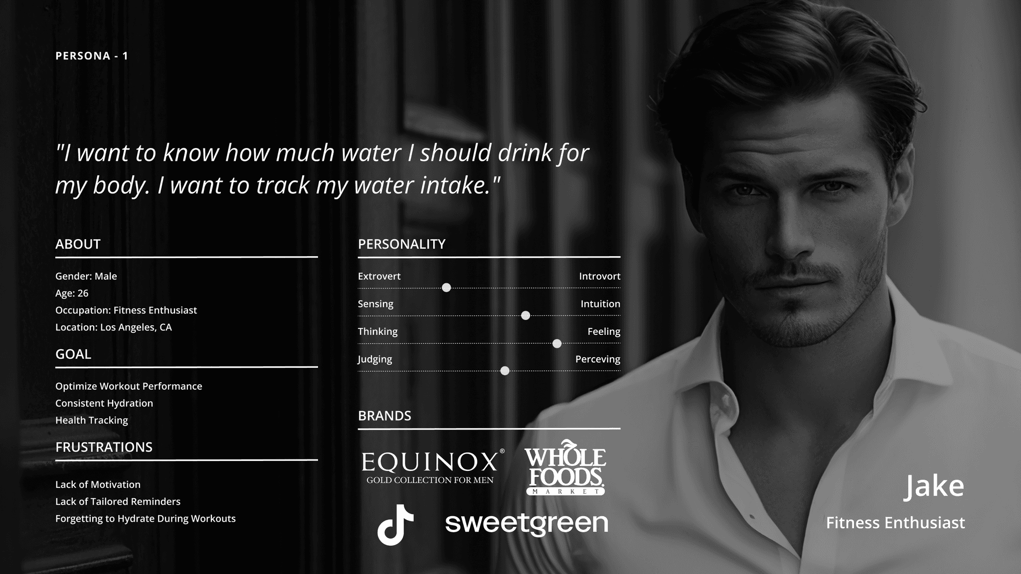
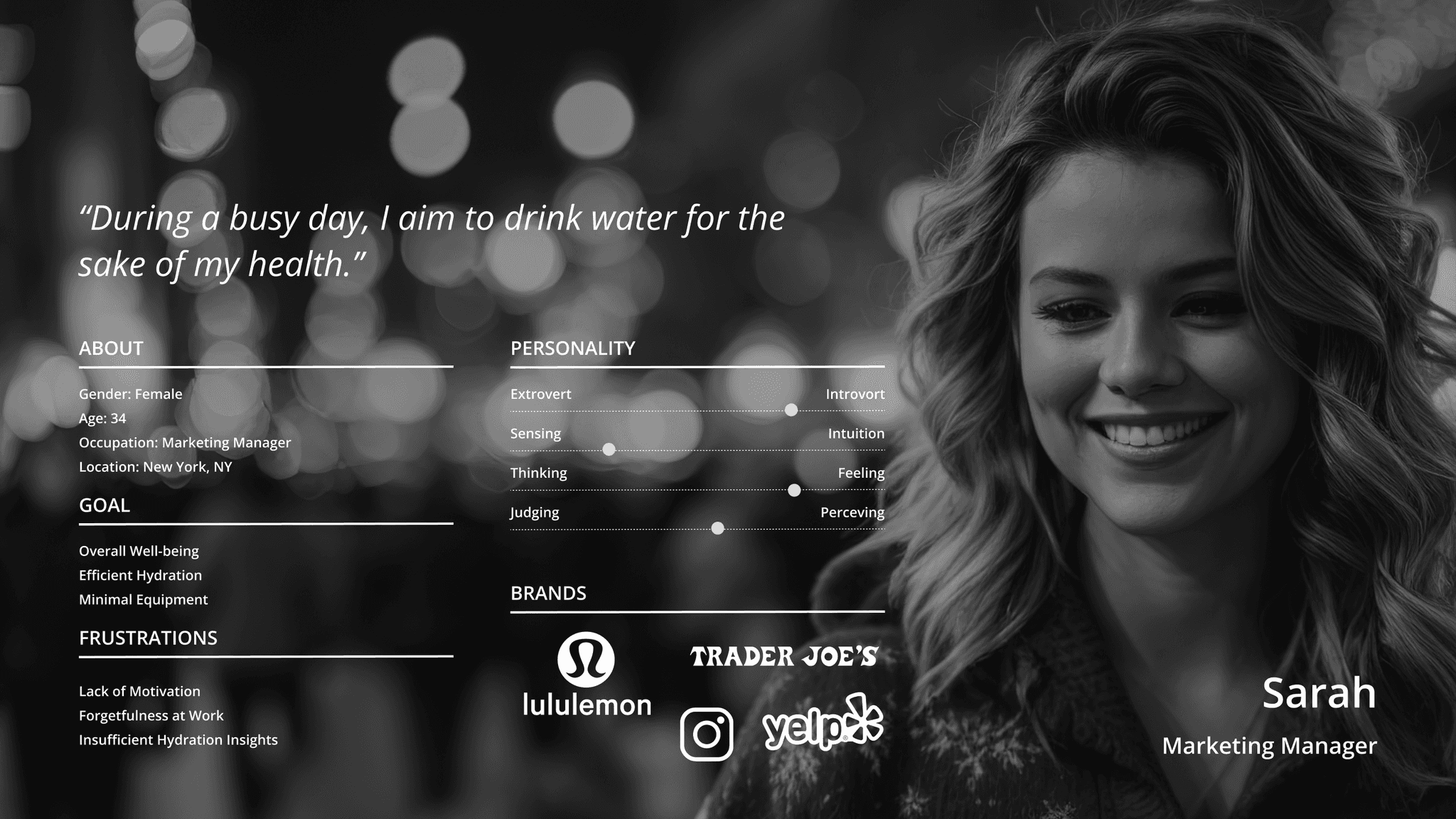
Persona
User Journey Map
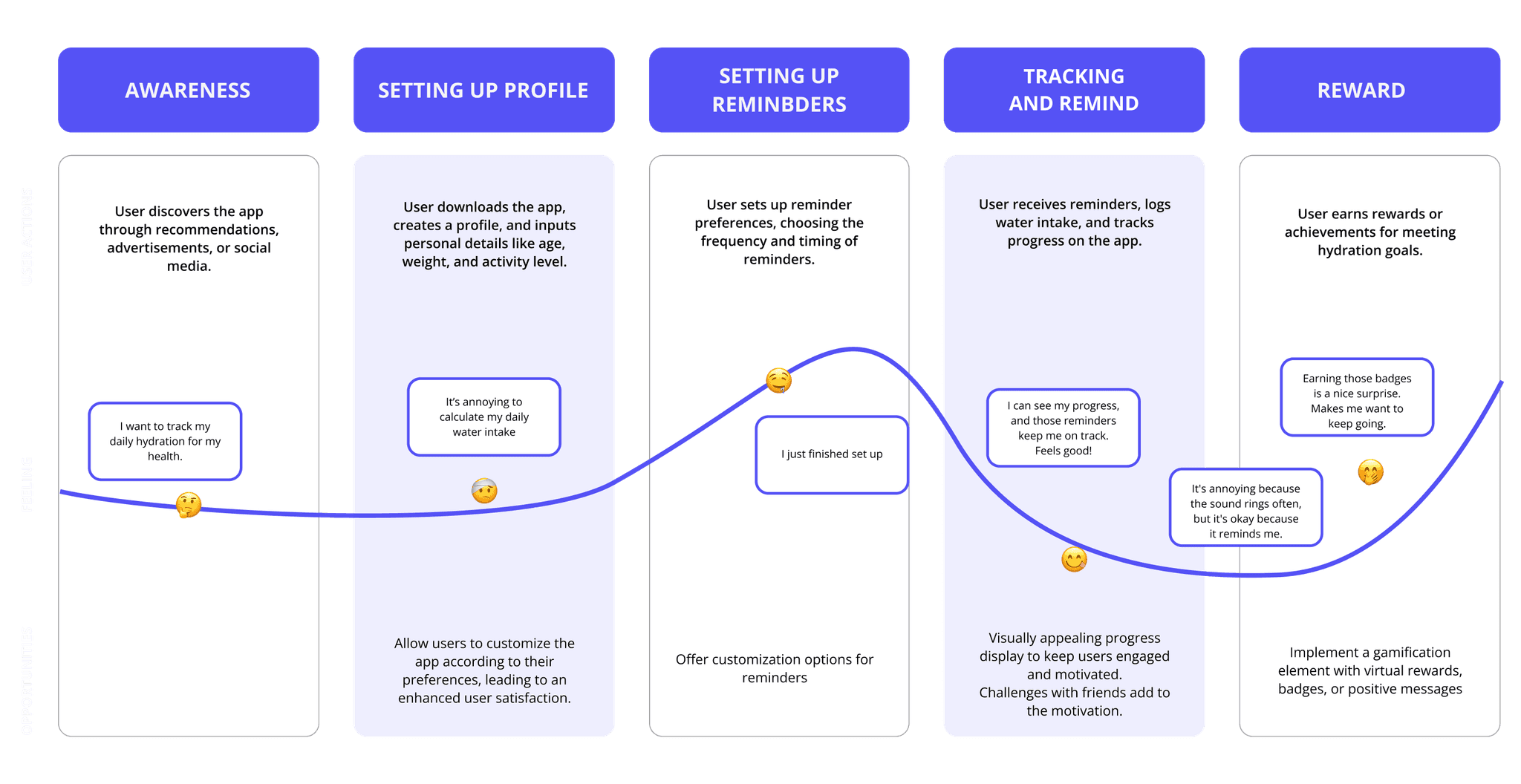
Problem Statement
01/
How might we help you measure how much daily water Intake?
02/
How might we help user track the amount of water you drink every day?
03/
How might we help you we give them motivation to drink?
Solution
13/
Customized Hydration Reminders
In this flow, users can set personalized water intake goals by entering their age, gender, and weight.
Also, they can set alarms to establish a consistent water intake routine.
02/
Drink Tracker
In this flow, users are allowed to add and track their beverages, from water to coffee, making it easy to monitor and improve their hydration habits.
03/
Challenge
In this flow, users can create challenges and invite friends to participate together.
Information Architecture
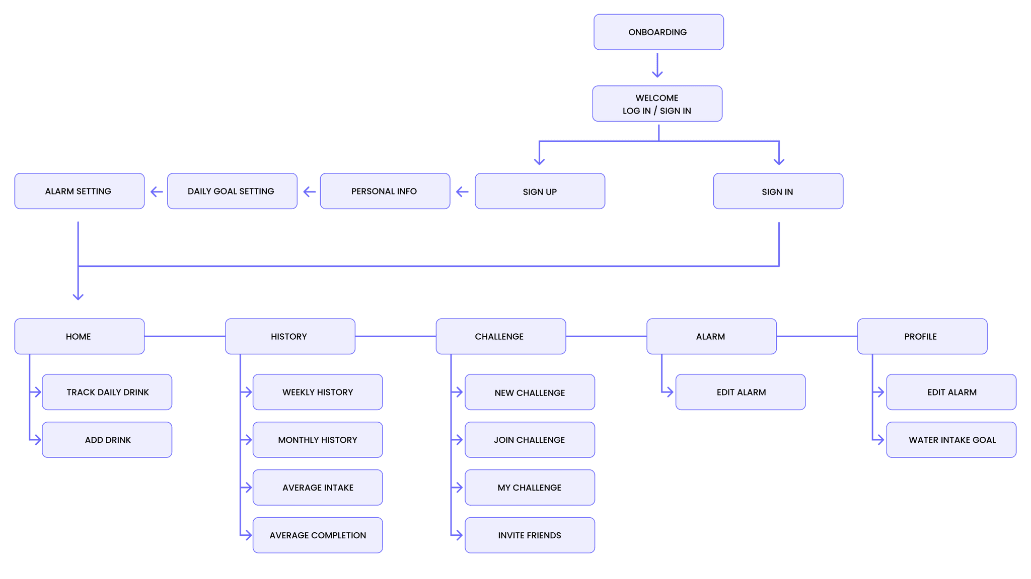
User Task Flow
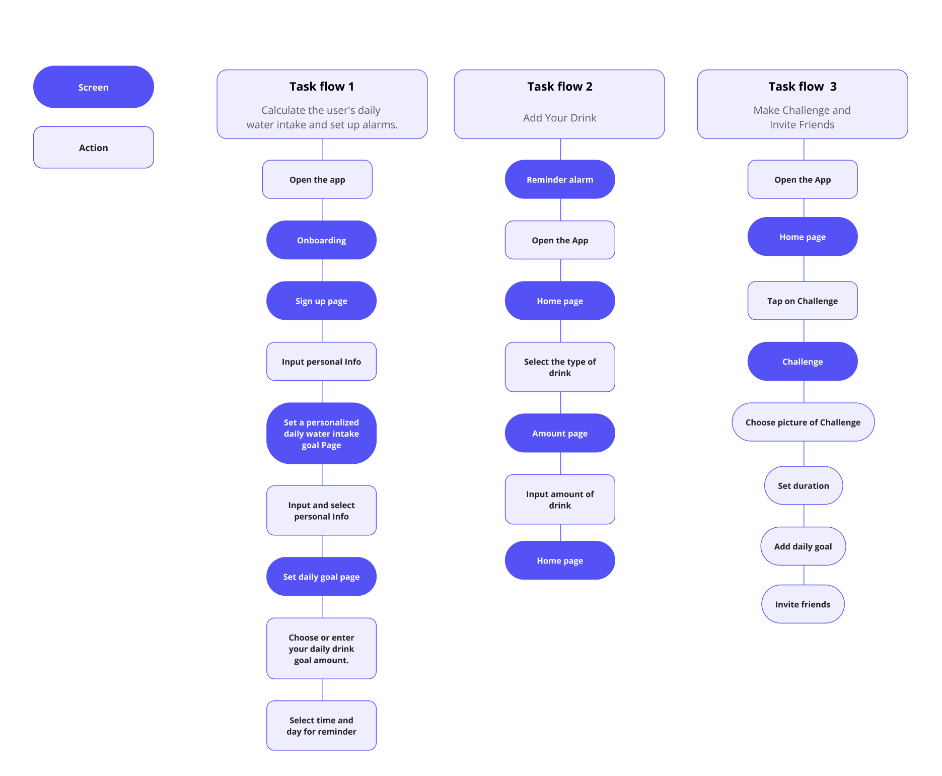
User Testing and Major Improvement
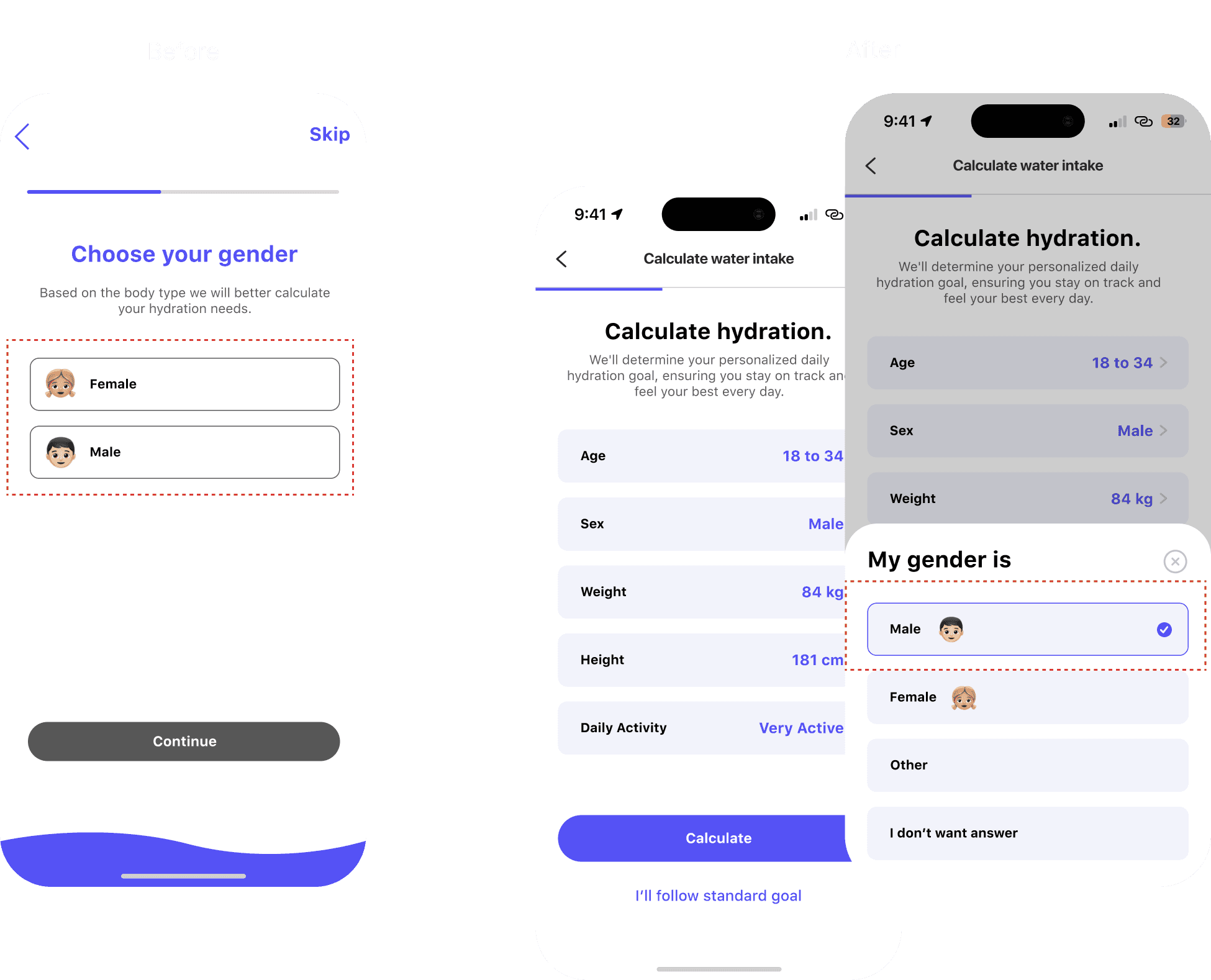
Calculate water intake page
Based on feedback, the interaction was considered cool and good, but users felt discomfort due to the excessive number of steps. Therefore, I have organized and streamlined the process, reducing the number of steps. Additionally, I have implemented a display for the selected status to enhance clarity. I've also redesigned the buttons to look distinct and clear, facilitating easy recognition for users.
Furthermore, I have replaced the 'skip' option with 'standard goal' to better align with user preferences.
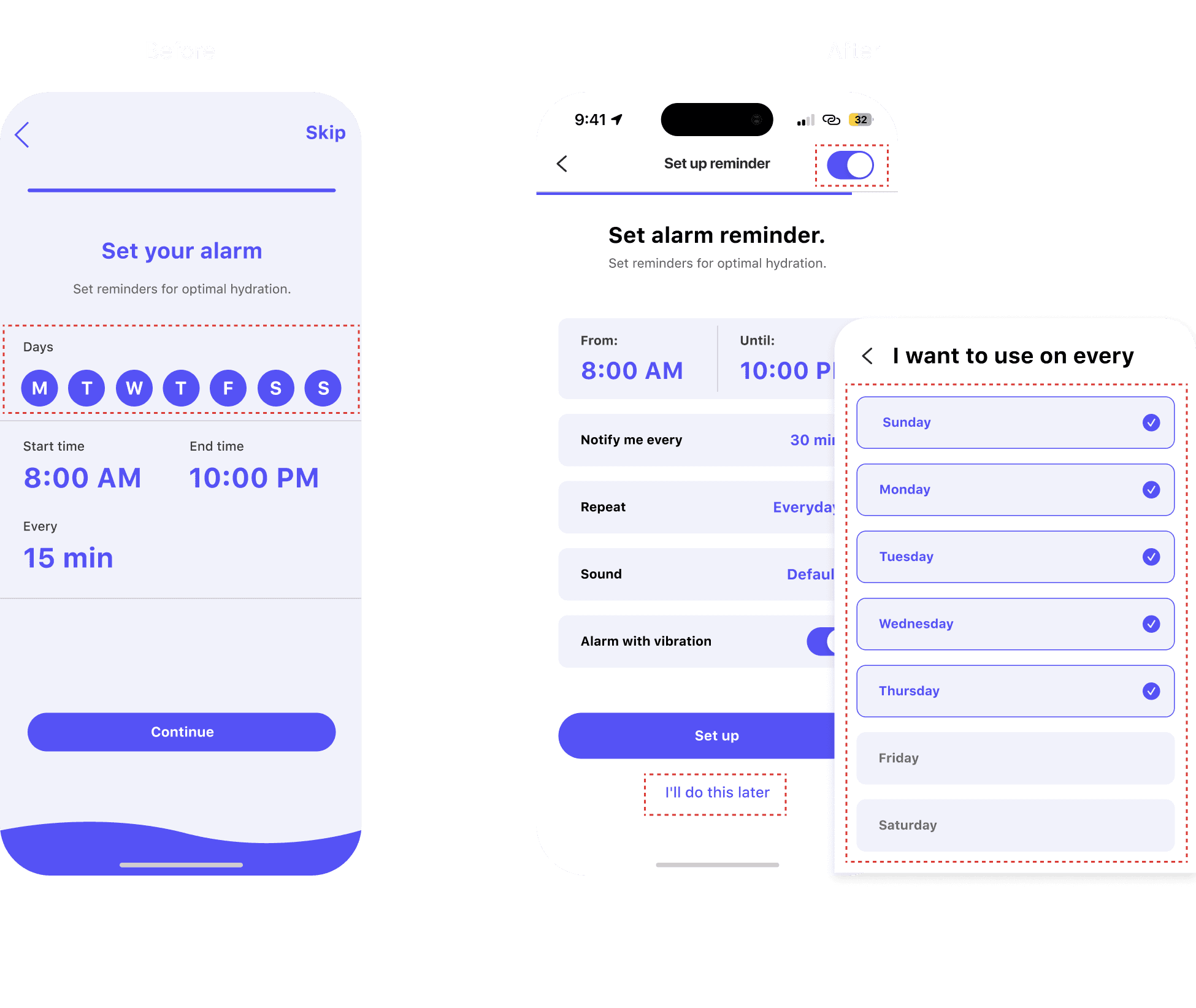
Set alarm reminder page
Following user testing, it became evident that some users encountered difficulty understanding the 'Days' buttons, primarily attributed to the use of only the initial letter of the first word and their close proximity. In response, I have introduced a new pop-up window with clearer and more user-friendly buttons. These buttons now also display the selected status for enhanced clarity.
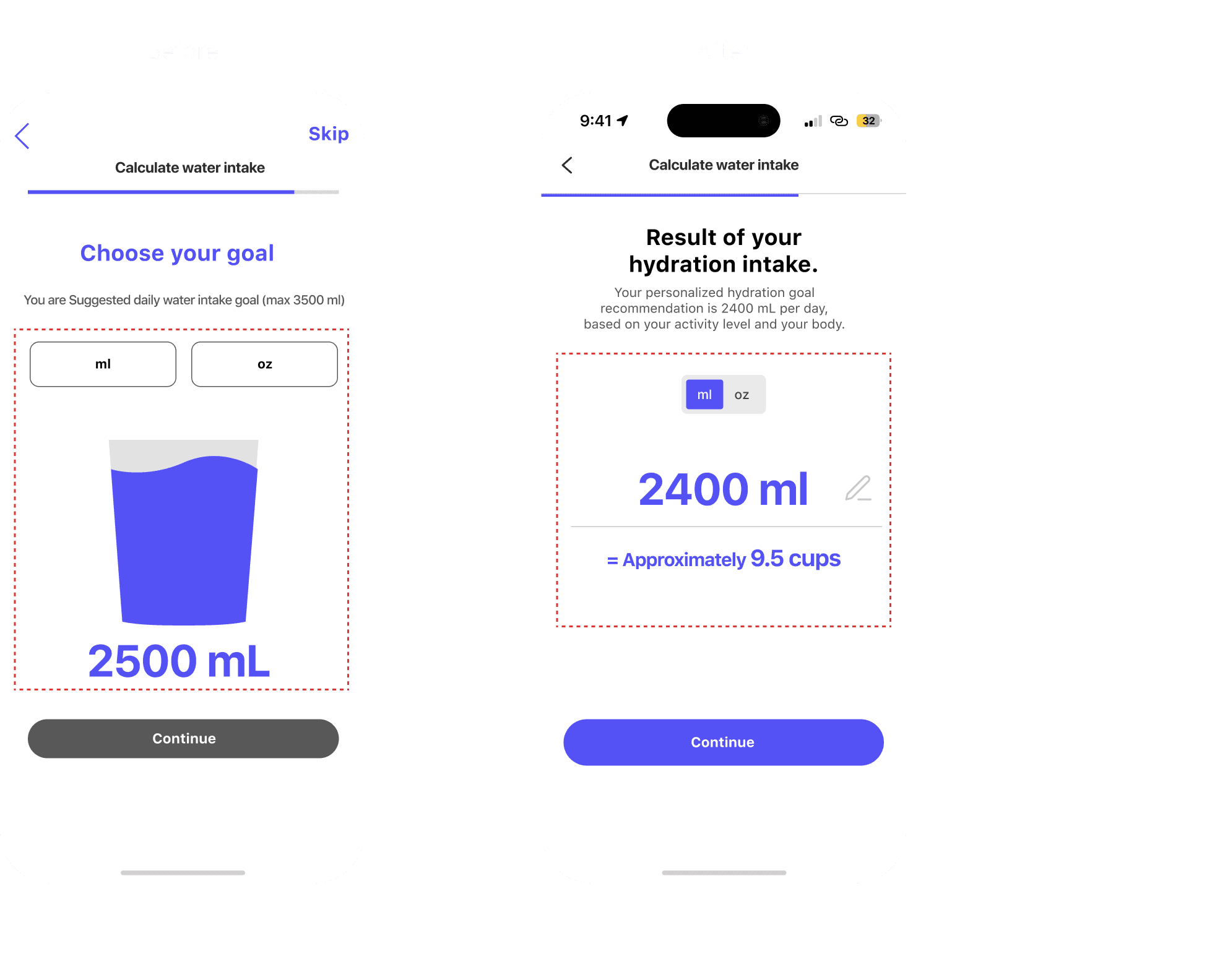
Daily hydration Intake result page
During the user tests,
When people were figuring out their goals, they were a bit unsure. So, I made it simpler by using a standard measurement of one cup, which is about 250ml. This way, they could better understand how much water they needed.
Based on feedback,
Users can easily change how much water they want to drink in this session, and I've made it simpler by using a handy toggle button instead of milliliter and ounce buttons.
I also added an edit button to change the goal.
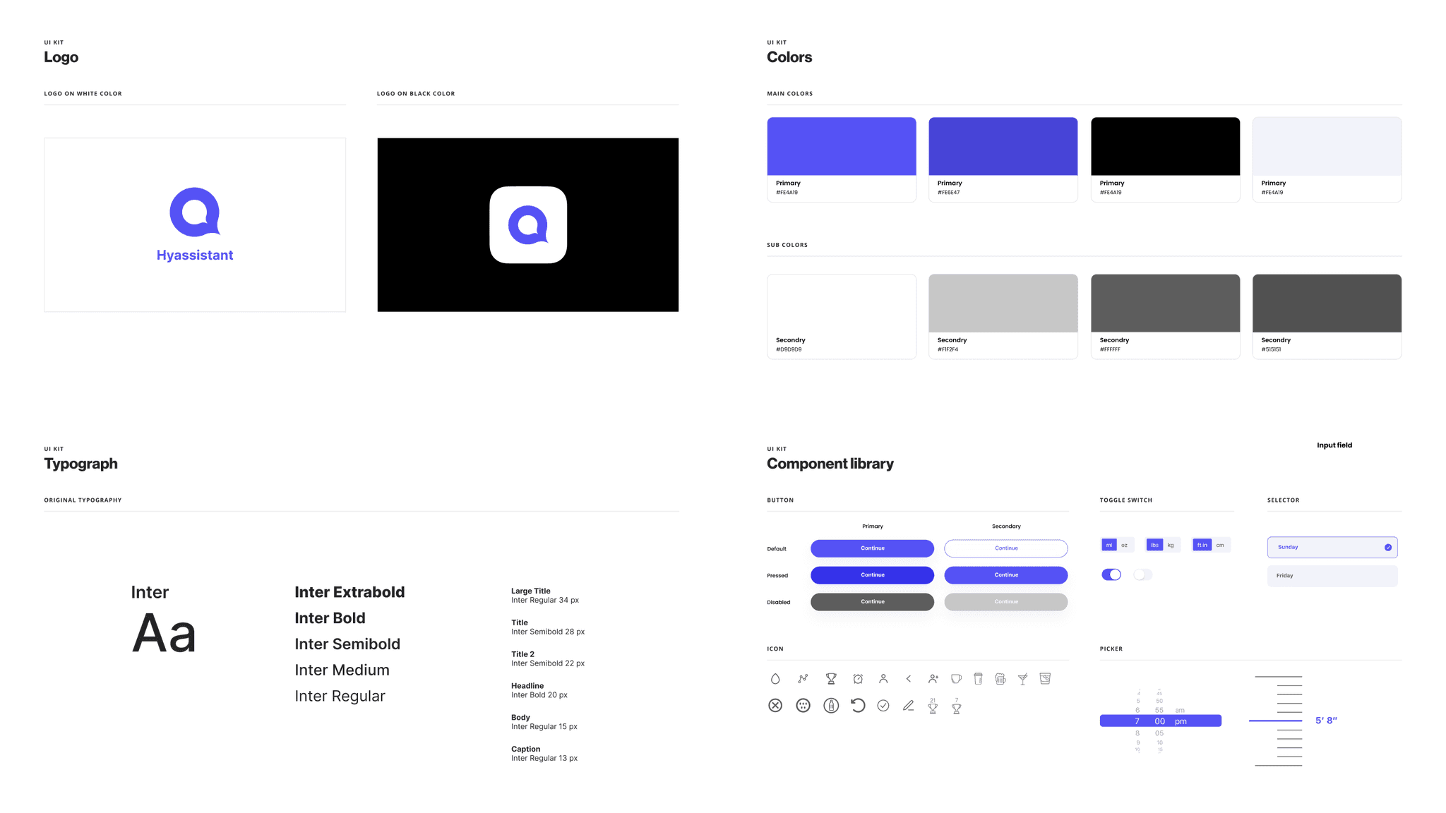
Style Guide
From the survey result I found out that
Reflection
What’s Next?
· Develop a feature that enables weekly and monthly analysis.
· Make a special page for badges when you complete a challenge.
· Want to add fun animations to make it feel like a game and boost motivation.
Lessons Learned
In my initial approach to my first UX case study, my focus was primarily on creating visually appealing designs with engaging interactions to attract users. However, as I delved deeper into the process, I came to the realization that prioritizing accurate status representation is paramount compared to merely having a stylish design.
User testing sessions, I gained valuable insights, underscoring the significance of user testing in the UX design process. This experience highlighted the need to balance aesthetics with functionality, ensuring that the user experience is not only visually pleasing but also reliably informative.

